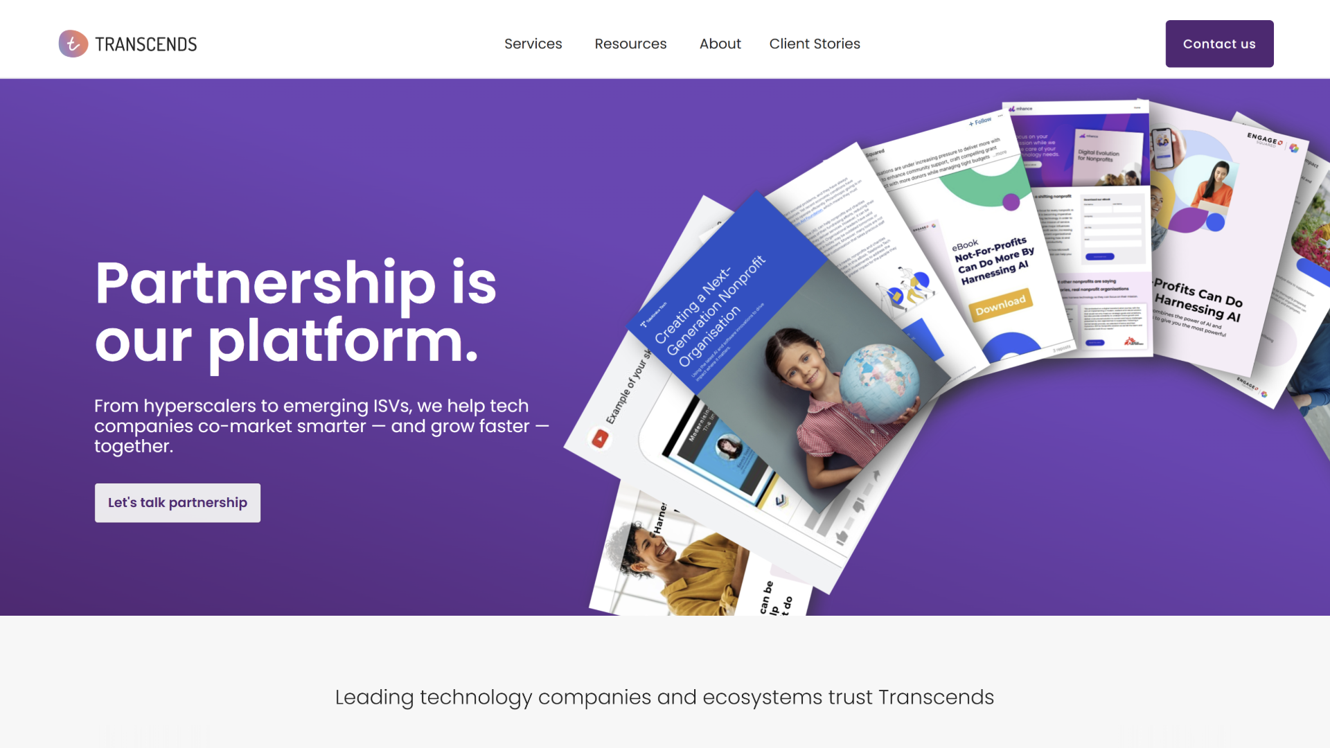
The agency site was weak, unclear, and not performing well. The first audience was potential clients and partners. At a pivotal moment of growth and repositioning, we were breaking into developing enterprise-focused AI and marketing solutions and needed the website to reflect this shift. A weak or confusing site would have undermined credibility and slowed business development, while a strong site could showcase our work and reinforce internal alignment.
The internal tension was real: taste versus clarity. We needed a site that felt professional and “grown-up,” moving away from outdated or garish design elements. Strong opinions from multiple stakeholders added complexity. We also needed a system that could host case studies, solution packages, and blog content that reflected current work — not just a laundry list of past deliverables.
Used AI to explore positioning and sanity-check tone for content and messaging.
Explored AI-assisted visualization of layout options to support decision-making.
Considered additional AI tools for iterative improvements if done today.
Designing for an agency I had worked with for years was uniquely challenging. The biggest lesson: shifting from transactional to holistic thinking requires both design and diplomacy. Today, I would involve fewer stakeholders and leverage AI more strategically to visualize solutions and streamline decisions.
This case study is for startups and agencies outgrowing their current messaging and digital presence. It invites those looking to upgrade their site and brand system without losing core mission and values.